


Cover Photo: CC BY James Dennes
Cross-view image geolocalization (CVIG) is the task of finding the location shown in an image taken at ground-level by comparing it to overhead imagery of potential locations. The application of CVIG to ordinary photographs of unclear origin, such as those sometimes found on social media, could have valuable applications. In the first blog post of this series, we introduced the Where in the World (WITW) dataset, a new dataset pairing Flickr photos with high-resolution satellite imagery from the WorldView-2 and WorldView-3 satellites. In the second blog post, we introduced the WITW model, a deep learning model for CVIG. In this, the final post of the series, we look at the model’s behavior in different ways to get a deeper understanding of what it does.
Visualizing Model Output with a Map
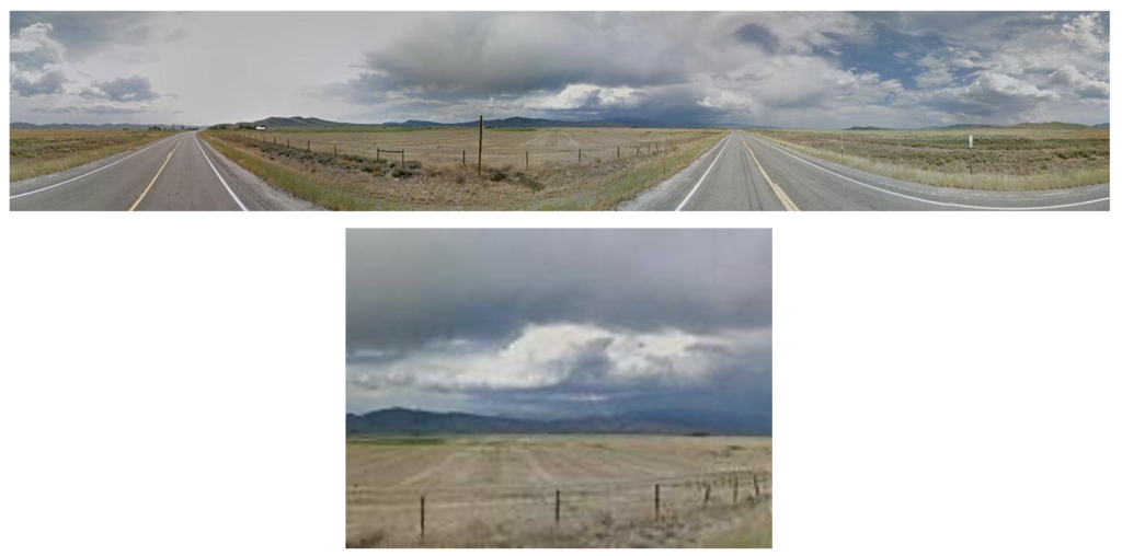
Although metrics like top-one or top-percentile are a concise way to measure model performance, they don’t convey much intuition about what’s going on. To see the model in action, its output can be visualized as a heat map overlaid on a map. Suppose we wish to geolocate the photograph shown in Figure 1, which was taken from the location marked on the satellite image in Figure 2. (A real-world use case would typically call for a larger search area, but for clarity a small one is used here.)
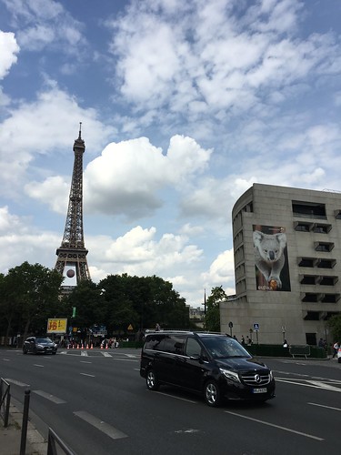
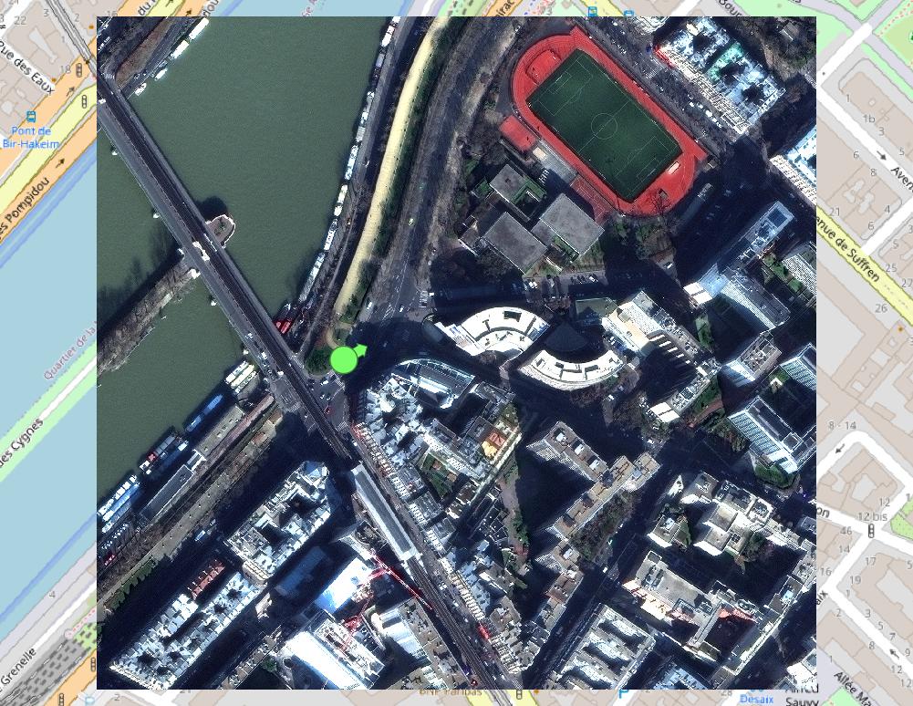
Figure 2: Satellite imagery showing the vicinity of the photo in Figure 1. The photographer’s geotagged location is shown as the pale green circle, and the direction in which the photo was taken is shown by the accompanying arrow.
To predict the photo’s origin, we consider a grid of points spanning the search area, which in this case is the area of the satellite image in Figure 2. For each point, we cut out a 225m-wide square of satellite imagery centered on that point and feed it through the model. (Note that the grid points are only 56m apart, so adjacent imagery squares have some overlap.) In Figure 3, the satellite image is overlaid with the resulting heat map – the better the fit of the nearest grid point, the darker the shade of red. Because the model predicts the best-fit viewing direction as an intermediate step to evaluating how a good a fit each location is, we can overlay that directional guess as well. That’s shown with the yellow arrows, and the length of each arrow also indicates the quality of the location match.
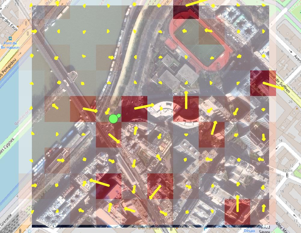
Figure 3: Heat map indicating best-matched locations for the photograph of Figure 1, according to the model. Darker shades of red indicate better fit. Arrow direction indicates best-fit viewing direction at each location, according to the model, and arrow length again indicates better fit. The pale green circle is ground truth.
In this example, the results are mixed. The model misses the nearest grid point, although it might not be a coincidence that three of the 10 best matches are adjacent to it. At the same time, it’s evident that the model is getting some things right by distinguishing that it’s not looking at the water or the sports stadium.
Differences Between Datasets
In the second post of this series, we showed that the performance of the model, as measured by top-percentile score, dropped from 99% to 4% when switching from the CVUSA dataset to the WITW dataset. For ground-level images, CVUSA uses oriented 360-degree panoramas recorded from a mapping service’s vehicles, while the WITW dataset uses ordinary photographs shared by thousands of photographers. Thus far, we’ve merely observed that the latter presents a more difficult task than the former. Now we want to take a closer look and say quantitatively why that’s true. To do so, we’ll start with the CVUSA dataset and progressively modify it to make it more and more similar to the WITW dataset.
Figure 4 shows how model performance changes as we progressively change CVUSA to simulate a dataset of ordinary photos. The two plotted curves show the two performance metrics: top-percentile and top-one. The leftmost points, labeled “Unmodified CVUSA,” show the performance on the unmodified CVUSA dataset. From there, the changes begin. First, we throw out the information about which way is north, because regular photos don’t usually have that. This gives the slightly lower performance seen in the next set of points, labeled “Panorama” in Figure 4. Next, we randomly crop the panoramas to replace them by slices of limited horizontal angular size – first 180 degrees, then 90, then 70, the last of which isn’t much wider than a typical photo. The next step along the trek to simulate ordinary photos concerns how the data is handled. For those aforementioned slices of limited field of view (FOV), the model was permitted to pick a different random slice of each image on each epoch. But with photographs there’s only one fixed view – a photo doesn’t change each time it’s seen. So starting with the points labeled “One View Only,” the initial crop of each panorama is random, but it does not subsequently change from epoch to epoch.
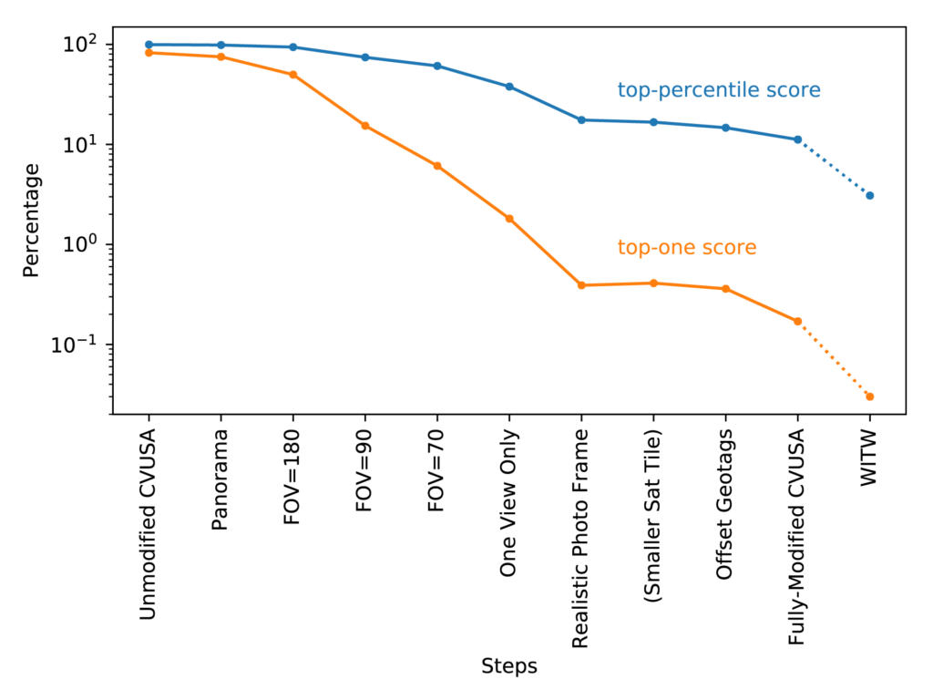
Figure 4: Model performance versus dataset. The blue (upper) line is top-percentile score, and the orange (lower) line is top-one score. The leftmost points are for the CVUSA dataset, and subsequent points are for increasingly modified versions of CVUSA. That’s except for the right-most points, which use a subset of the WITW dataset equal to CVUSA in dataset size.
For the next step, labeled “Realistic Photo Frame” in Figure 4, we note that individual photos vary in how the image is framed. Specifically, they differ in layout (i.e., portrait vs. landscape), aspect ratio, zoom, and elevation (i.e., tilt angle). A very rough distribution was estimated for each of these variables based on the WITW dataset and common photography practices. Using random crops drawn from that distribution, instead of simple 70-degree slices, resulted in a modified CVUSA dataset that captured the compositional differences among photos much more realistically than simple slices did. Figure 5 shows an example of how this step turns a CVUSA panorama into something that would not look out of place among a tourist’s photos.
Having modified CVUSA’s ground-level panoramas to resemble photographs from ordinary cameras, the next set of modifications concerned CVUSA’s overhead imagery. In CVUSA, the alignment between the location of the ground-level image and the center of the overhead image is quite precise. But for WITW, the alignment is limited by the limited accuracy of the photographs’ geotags. Since this issue can be expected to contribute to the performance difference between the two datasets, it was simulated as well. After first checking that a 27% size reduction in the overhead images did not have a large performance effect, random crops of the CVUSA overhead imagery were used to simulate small errors in the geotags. Next, overhead images were randomly swapped, affecting 6% of the data, to simulate the less-common occurrence of completely wrong geotags. The result of making these changes, in addition to the realistic photo framing described above, is given by the second-to-last set of points in Figure 4 (labeled “Fully-Modified CVUSA”).
That second-to-last set of points represents the full attempt to modify CVUSA to be as similar to the WITW dataset as possible. The result is a top-percentile score of 11% and a top-one score of 0.17%. By comparison, training/testing with subsets of WITW equal in size to CVUSA gave a top-percentile score of 3.08% and a top-one score of 0.03%. The difference may mean the simulation isn’t perfect or leaves things out, such as the difference between WITW’s largely urban imagery and CVUSA’s largely rural imagery. But this unaccounted-for difference is small compared to the total performance difference between the two datasets.
The most important conclusion to draw from this set of experiments is that no single factor is wholly or largely responsible for the performance difference between CVUSA and the WITW dataset. Instead, the huge performance difference between aligned panoramas and ordinary photographs is the collective result of many small effects, as shown by the gradual performance decline in Figure 4 as they are added in one-by-one.
An important prediction of Figure 4 is that a model’s performance could be meaningfully improved if the training dataset had flawless geotags. In this experiment, simulating geotag problems caused the top-percentile score to drop by six percentage points. That suggests that hand-checking or hand-labeling of geotags might lead to performance gains. Another general observation is that top-one performance falls off more quickly than top-percentile performance as the dataset becomes more challenging to work with. The implication is that analysis pipelines that can consider multiple top candidates, instead of relying on a perfect match every time, can be much more resilient to challenges and imperfections in training and testing data.
The Effect of Training Dataset Size
As a final exploratory study, we consider the effect of training data quantity. For the WITW dataset, the dataset size was determined by the geographic extent of SpaceNet’s high-resolution optical satellite imagery and the quantity of available outdoor geotagged Flickr photos therein. Any time a deep learning model is trained, it’s worthwhile to consider the question: Could model performance benefit from more training data, or is the model already operating near the maximum of what its architecture and the nature of the task allow?
A previous IQT Labs study developed a straightforward way to predict the likely benefit of added training data. The procedure is to repeat the process of training the model using various smaller training data quantities, then plot a graph of performance vs. training data quantity, fit a curve, and extrapolate. A function of the form y = a – b / x^c was found to work well for the fit. Applying this procedure to the filtered WITW dataset gives the plot shown in Figure 6.
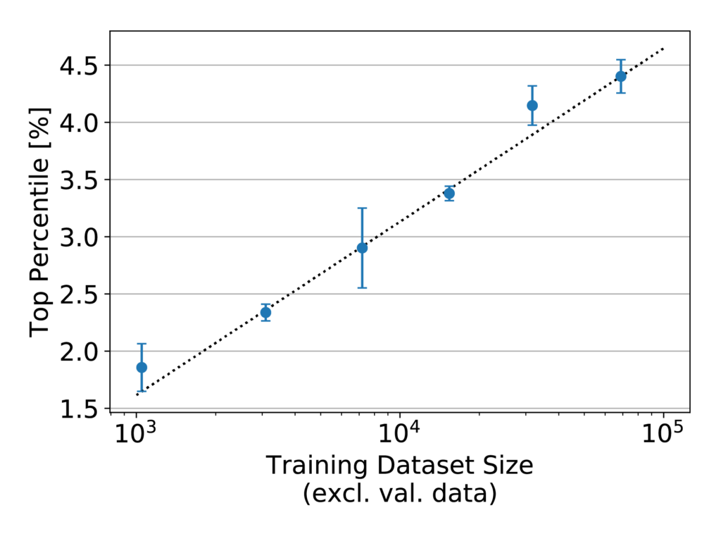
Figure 6: Model performance, as measured by top-percentile score, versus training dataset size for the WITW model with the filtered WITW dataset. Note the logarithmic x-axis.
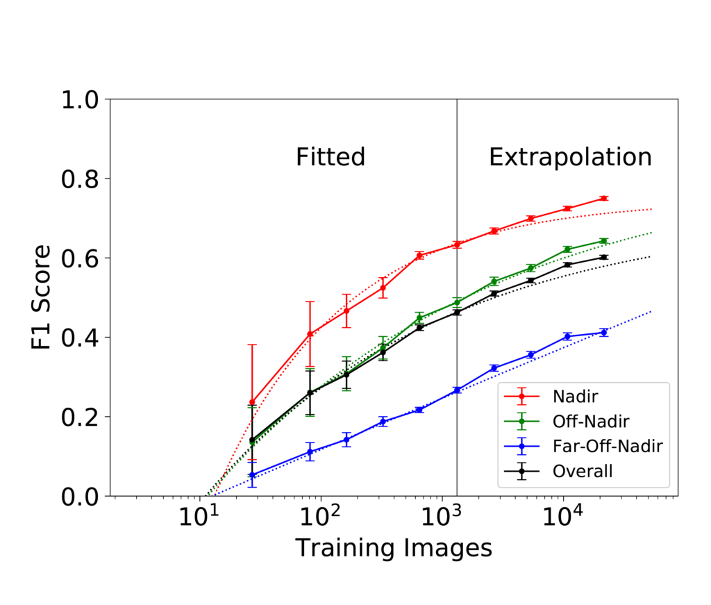
In Figure 6, the points fall almost exactly in a line. Such an arrangement on a plot with a logarithmic x-axis indicates consistent logarithmic growth. That attribute is of greater significance than may at first be evident. Generally, plots of performance vs. training dataset size on a linear-log scale like this begin to flatten as they approach their maximum achievable performance. Figure 7 shows an example of what that looks like.
Within the range of training dataset sizes shown in Figure 6, every doubling of the training data quantity increases top-percentile score by just over half a percentage point. The consistency of this trend, which persists over nearly two orders of magnitude, strongly suggests that adding more training data to the dataset would increase performance further. As to how much further is possible, estimates of the asymptotic maximum become unstable in the case of a nearly straight line on a linear-log plot. In short, more training data is predicted to improve model performance, and the maximum possible improvement is not known but could be substantial.
Conclusion
For investigative reporters and fact checkers, the ability to track down a photograph’s geographic origin is a valuable tool. When there’s a shortage of available on-the-ground photos or other media to use for comparison, satellite imagery provides a globally available option. The first two posts in this series addressed designing a CVIG dataset and model focused on the difficulties of working with photographs. This blog post took the analysis further. By looking at model output with a geospatial approach, it was possible to go behind the raw performance numbers to better understand the model’s strengths and weaknesses. Using one dataset to simulate another helped quantify the many real-world factors that affect model performance. And a look at training dataset size pointed to the potential of big data at even greater scales to drive improvement. With the increasing study of cross-view image geolocalization, this technology is on the cusp of advancing from mere research subject to enabling real-world capabilities.
Key Project Results
Looking back over the project as a whole (as described in this series of three blog posts), we can draw some overall conclusions:
- Cross-view image geolocalization (CVIG) is the process of geolocating an outdoor photograph by comparing it to satellite imagery of candidate locations. It could ultimately provide a valuable tool for investigative journalists and others who need to assess the veracity of photograph-supported claims.
- Although not being publicly released, the Where in the World (WITW) dataset is a novel dataset of image pairs for CVIG deep learning. It pairs high-resolution SpaceNet satellite imagery with ordinary photographs taken by thousands of photographers in nine cities, domestic and foreign, across five continents.
- The WITW model, a deep learning CVIG model based on state-of-the-art techniques, is open-sourced under the permissive Apache 2.0 license and is publicly available.
- Ordinary photographs are uniquely challenging. Performance by one measure drops from >99% to ~3% when switching from aligned panoramas to an equal number of ordinary photos. No single factor is responsible for that – it’s the collective result of many small, quantifiable effects.
- Sometimes, less data can be better. Filtering the dataset with machine learning to remove irrelevant image pairs produces a smaller but higher-quality dataset that’s more effective at training models.
- Sometimes, simpler models can be better. We identified cases where more elaborate models or training procedures, hypothesized to improve performance, had the opposite effect.
- Data visualization brings insights. Overlaying model output on a map can help show what’s going on at a glance.
- We haven’t reached the limit of what this model can do. Extrapolation shows that getting more training data (of equal quality to what we have now) would improve model performance. The maximum possible improvement is not known but could be substantial.
- CVIG has a ways to go for real-world use cases with ordinary photographs, but its tremendous potential calls for further investigation.

This post originally appeared on the IQT Blog.
1. Introduction
The RarePlanes satellite imagery dataset is rich enough to enable copious machine learning and object detection studies, particularly when coupled with attendant synthetic data. In previous posts (1, 2), we discussed the dataset and initial aggregate results for the “Synthesizing Robustness” IQT Labs project, which seeks to determine whether domain adaptation strategies are effective in improving the detection and identification of rare aircraft from the satellite perspective. In this post we discuss detailed results for object detection models, focusing on geographic disparities and individual object classes. We quantify how much harder rare objects are to localize, though this is highly dependent on specific aircraft properties.
2. Aggregate Scores Summary
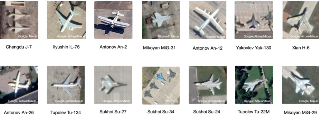
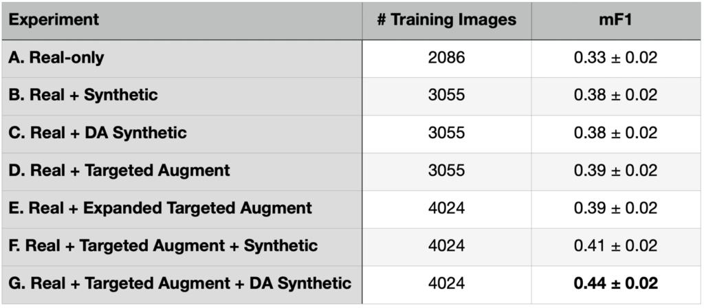
For the Synthesizing Robustness project, we focus on 14 aircraft classes (plus a catchall “Other” category) in both real satellite imagery and synthetic data. These 14 classes include 12 Russian and two Chinese makes. There are originally 99 aircraft classes (from North American T-28 Trojan to Douglas C-47 Skytrain to Chengdu J-20), so the “Other” aircraft class collapses 85 aircraft classes. See Figure 1 for the selected aircraft classes, and our Results Part 1 blog for full details about the dataset. Recall that we ran a series of experiments in the previous blog, eventually finding that combining targeted augmentation of the real data with domain adapted synthetic data (Experiment G) provided the best performance (see Table 1).
3. Geographic Insights – Seen vs Unseen Locales
In this section we investigate performance differences in finding and identifying aircraft in seen versus unseen locations. All test images are distinct from the training set, though some test images are taken over the same airport as training images (though on different days).
There are 164 test collects, and 75 unique test locations in our dataset. Each location has multiple observations, and 30 locations (47 total collects) at the same location as the training imagery (though on different days than the training collect). Therefore, 45 locations are unique to the test set, encompassing 117 total collections. In Table 2 we show the performance of the best model (Experiment G: Real + Targeted Augment + DA Synthetic) when broken down by geography.
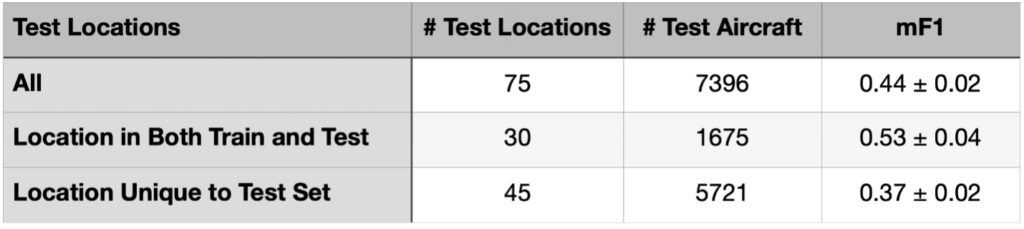
Table 2 indicates that prediction in unseen locales is far inferior to prediction at locations present in the training dataset. While this result may not be qualitatively surprising, quantifying the magnitude of the improvement (43% or 3.5σ) is important for ascertaining the robustness of the model to various deployment scenarios.
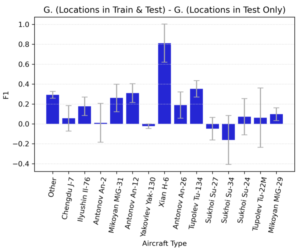
In Figure 2 we show the performance delta for each aircraft class between novel and already-seen locations. For the majority of aircraft classes, performance is only marginally improved if the location has been seen already, though for some aircraft types (e.g., Xian H-6) it is significantly improved.
4. Performance By Training Dataset Size
Much of the rationale for undertaking the original RarePlanes project and the follow-on Synthesizing Robustness project was to study how object detection performance varied according to training dataset size. Results from the initial RarePlanes study are available here, though the Synthesizing Robustness project filters the data differently and will have different results.
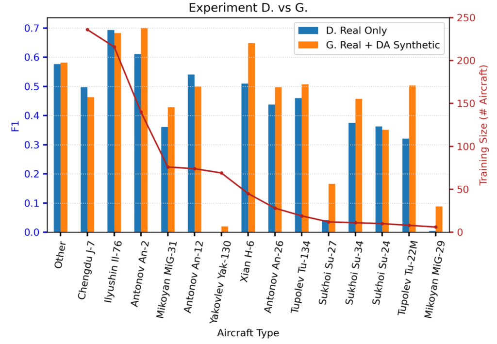
In Figures 3 and 4 we show the detection performance for each aircraft class.
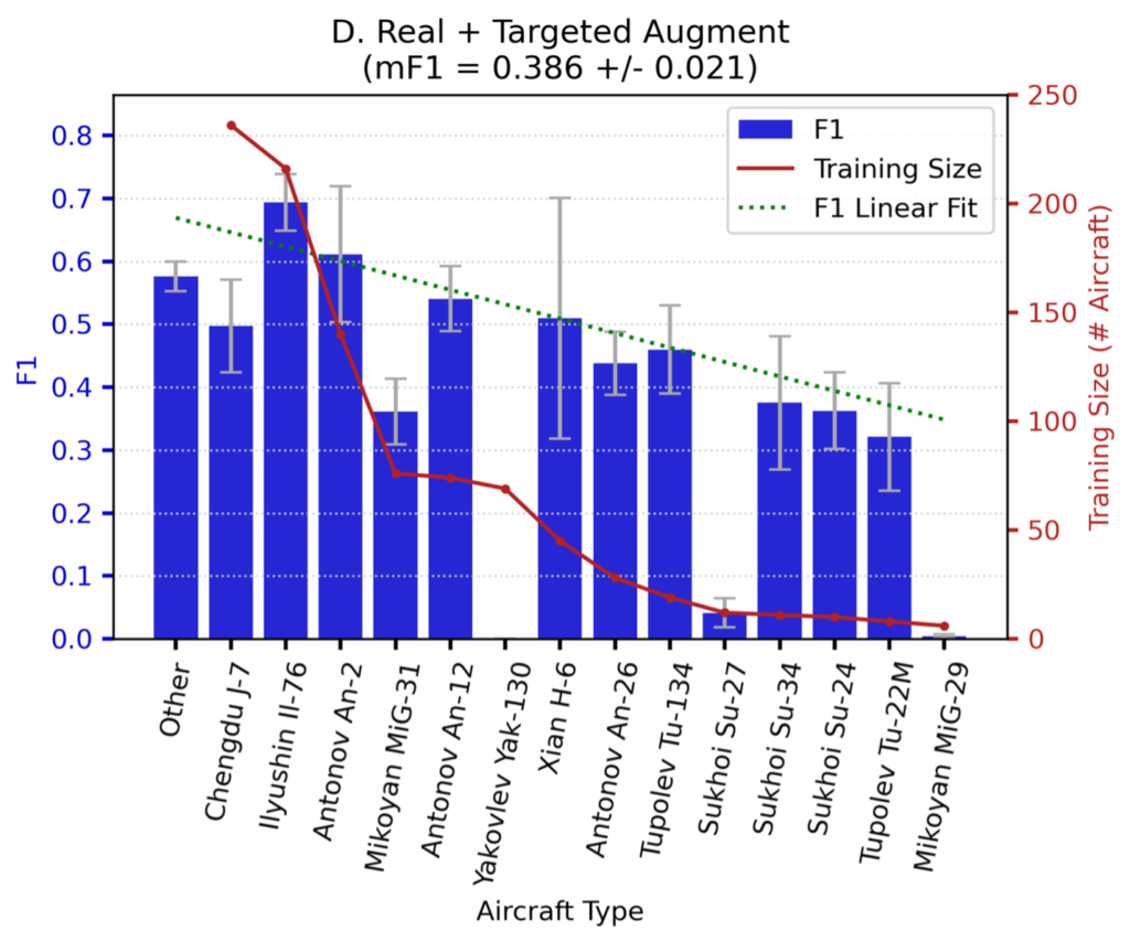
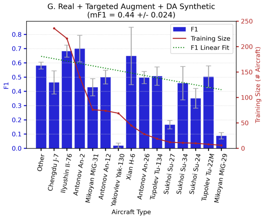
Note that performance for Experiments D and G trends downward with decreasing training dataset size. Also note that the (rather poor) green-dotted linear fit line is both steeper and lower for Experiment D, meaning that adding domain-adapted synthetic data in Experiment G provides greater value for rare objects than common objects. There are a few outliers in the plots (e.g., Yak-130, Su-27) that we discuss in a later section.
Figure 5 shows the performance difference between Experiment D (real only), and Experiment G (real + DA synthetic). We see that for the most difficult classes (e.g., Yak-130, Su-27, MiG-29) the synthetic data provides a huge improvement. For example, scores for MiG-29 detection increase by over 20× when using the domain-adapted synthetic data.
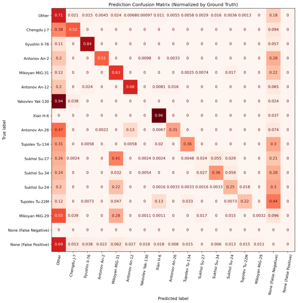
5. Confusion Matrices
We now dive into specifics of classification errors. In Figures 5 and 6, we compute the confusion matrix between classes. While confusion matrices are often used in simple classification problems, they are less common in object detection scenarios due to the presence of non-classification errors (i.e., false negatives and positives). Accordingly, we compute and plot false negatives and positives in Figures 6 and 7.
Experiment D.
Experiment G.
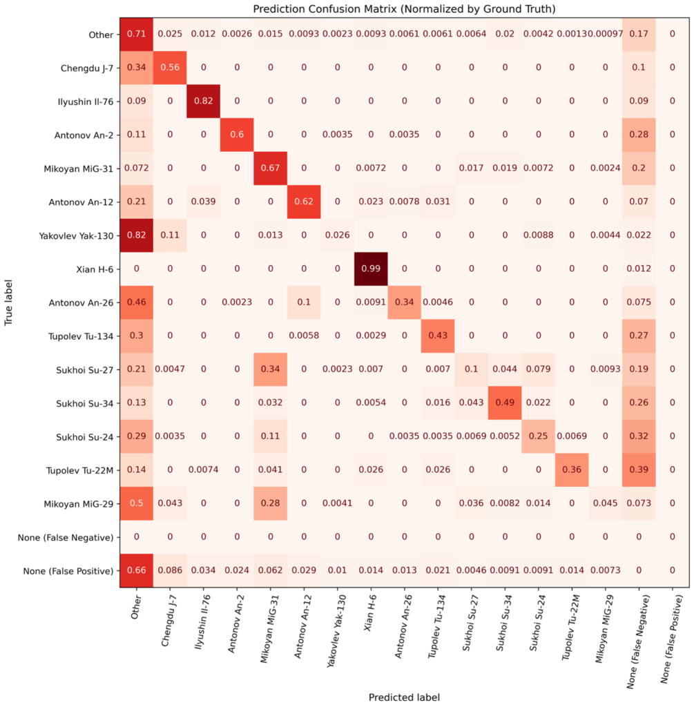
Figures 6 and 7 also illustrate why the scores of certain classes are lower than expected. For example, detection of Su-27s is lower than one might expect (given the trends of Figure 5), but Figure 6 demonstrates that the primary reason for the low detection score is that Su-27s are frequently confused with MiG-31s – another Russian fighter aircraft. Note that for most aircraft makes (particularly the rarest ones), the diagonal in Experiment G is higher than for Experiment D. Note that for most aircraft makes (particularly the rarest ones), the diagonal in Experiment G (Figure 7) is higher than for Experiment D (Figure 6). There are also fewer false negatives and misclassifications as Other in Experiment G. This helps explain the performance boost of the domain-adapted synthetic data used in Experiment G: both overall detections are improved (fewer false negatives), and aircraft makes are identified with higher fidelity (fewer misclassifications).
6. Conclusions
In this post we delved into the specific successes and failures of the YOLTv4 detection model employed in the Synthesizing Robustness project. We showed that predictions in previously seen airfields are significantly higher than predictions for novel, unseen airfields. We also found that domain-adapted synthetic data provides the most value for the rarest classes (see Figure 5), which is consistent with the original findings of the RarePlanes project.
Specifically, the RarePlanes project found greater utility for synthetic data for the rarest object classes. We find that, for this study, domain-adapting the synthetic data provides even more benefit for rare categories. While there is a general trend toward lower performance with fewer training examples, there are significant outliers to this trend. Inspection of the confusion matrix for aircraft classification reveals the degree to which similar aircraft are confused (e.g., Su-27 and MiG-31), and insights into the shortcomings of the model even with domain-adapted synthetic data.
Our research shows that if synthetic data is available, domain-adapting the synthetic data and combining with a targeted augmentation of the real data is a relatively easy way to improve both model performance and the utility of the synthetic data. Synthetic data certainly is not a panacea, and certain classes of objects may see little to no improvement with synthetic data. In summary, after multiple experiments we can conclude that extracting utility from synthetic data often takes significant effort and creativity.
This post concludes our Synthesizing Robustness project. We encourage interested readers to delve into the previous blogs in this series (1, 2), the original RarePlanes project, or reach out to us with questions.
* Thanks to Nick Weir and Jake Shermeyer for their efforts on experiment and dataset design. Thanks to Felipe Mejia for assistance with domain adaptation training.
